
项目信息
类型
Design System
Client
Too Good To Go (Unofficial)
Role
UX Designer
Time
Oct 2025-Dec 2025
Tools
Figma & Zeroheight
Team
Carol B, Wendy L, Shreya L, Rohini R
Redesigning Too Good To Go’s Interface Foundations
Project Overview
Introduction
My Role
What we delivered?
Bagel is an unofficial design system built for Too Good To Go, designed to turn a complex, growing interface into a clear, consistent, and accessible system. It combines reusable components, shared principles, and documentation to support long-term scalability.
Design System Editor
Component Documentation Contributor
🥯 Design System Foundations
Established a shared visual and structural foundation (color, typo, spacing, token, grid) to ensure consistency, hierarchy, and accessibility across the interface.
🥯 UI Kit
Built a reusable library of components and tokens that supports efficient design and scalable implementation.
🥯 System Documentation (Zeroheight)
Documented components, usage, and behaviors in Zeroheight to make the system understandable and easy to adopt.


What is Too Good To Go?
We deconstructed Too Good To Go, and found 4 problems.
Problem 01
Ten Shades of.....Grey?
Problem 03
Icons are Having an Identity Crisis
Problem 04
Hard to Read, Easy to Miss
Problem 02
Button Déjà Vu
Too Good To Go is a mobile app that helps reduce food waste by connecting users with restaurants and stores that sell surplus food at a discounted price. Known for its friendly tone and strong environmental mission, the platform appeals to a broad audience who want to make more conscious consumption choices.
As Too Good To Go expanded across regions, teams, and product touchpoints, the interface began to fragment. Design decisions were made in parallel without shared rules, leading to visual inconsistencies, repeated effort, and unclear patterns.
We broke down TGTG’s interface using atomic design principles, identified recurring patterns across cards, buttons, chips, and navigation.
Color usage across Too Good To Go is inconsistent. While brand colors are applied clearly to primary actions, multiple similar grey tones appear throughout the interface without clear rules or meaning.
Icon usage across the app is inconsistent. Icons vary in shape, corner style, and stroke weight, and even the same symbol appears in multiple forms.
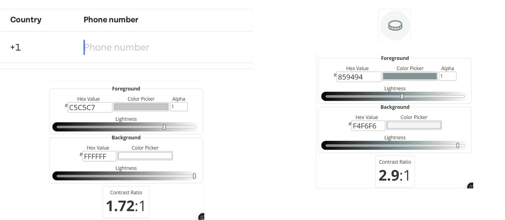
Some accessibility issues remain in the app. Certain color combinations fail to meet WCAG contrast requirements, and closely spaced buttons create small tap targets that may hinder usability for users with motor or visual impairments.
Buttons are used to represent actions across the app, but similar actions appear in multiple button styles and sizes. Primary buttons vary in height, and the same actions are represented by different icon styles, creating ambiguity for designers and developers when building new features.


The Problem: Why Redesign Too Good To Go’s Design System?


Solution: How Can a New Design System Help?
Our Process: How we build the bagel design system?
Without shared rules, scaling becomes fragile. A design system provides a stable foundation that supports growth across teams and markets.
Enable Scalable Growth
Inconsistent components create inconsistent experiences. A design system establishes clear rules that make the interface predictable, cohesive, and trustworthy.
Improve UI Reliability
Lower the Cost per Feature
Without a system, every feature requires rethinking UI patterns from scratch. A shared design system speeds up design and development by enabling reuse and reducing rework.
Step 1/3
Set the rules that keep every bagel consistent.
Step 2/3
Building Bagel: From Foundations to Patterns
To avoid designing components in isolation, we began by defining a small set of design principles.
With the design principles in place, we built the core of the Bagel Design System: starting from foundations, scaling up through components, and finally connecting everything through patterns.
We began by defining the system foundations: color, typography, spacing, and grid. Green was set as the anchor color to align with Too Good To Go’s sustainability-driven brand.
We continued using Tenon to maintain brand continuity, and applied a consistent grid and spacing system to establish a shared structural baseline.
For iconography, we used Microsoft’s Design System-Fluent to unified the icons style.
My contribution: defined the spacing and grids, named the token.
From there, we systemized core UI components (buttons, cards, chips, etc.) by designing them with flexible properties and variants to support multiple scenarios.
My contribution: created card, bottom navigation, search bar and divider components
Beyond individual components, we created patterns as ready-made building blocks that teams can reuse across screens. These pre-built patterns reduce the need to start from scratch, and speed up execution
My contribution: built header and carousel patterns.
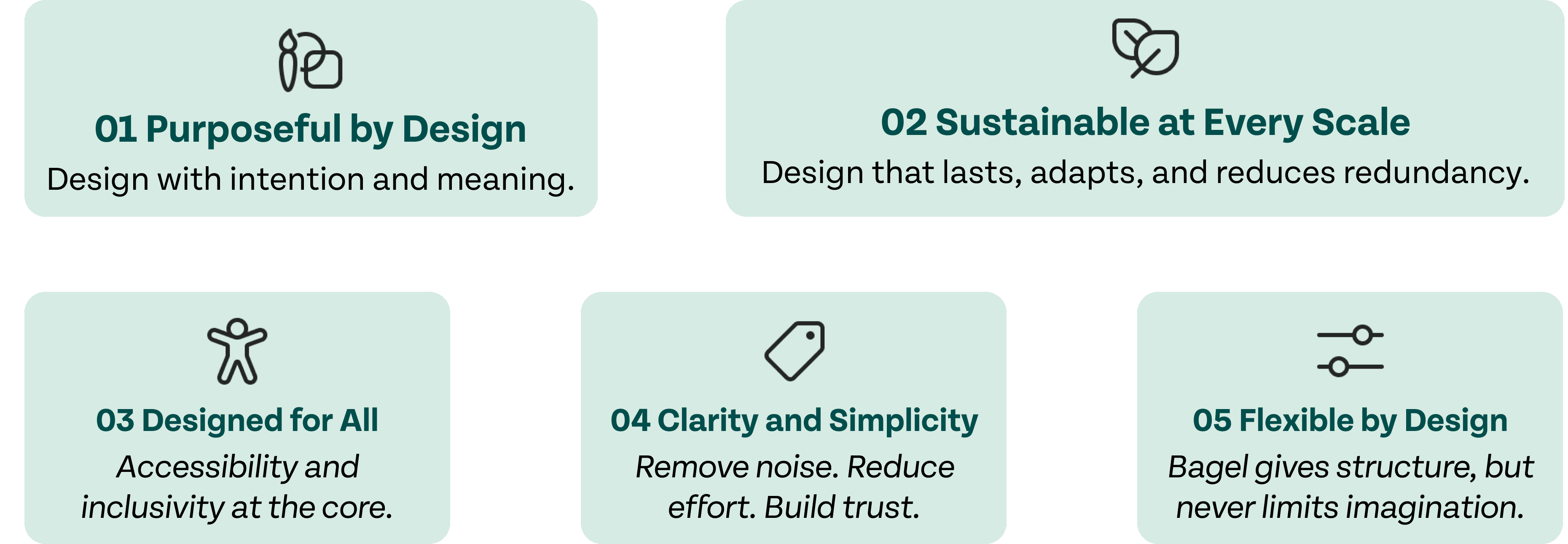
Reflection: This step helped me shift my mindset from asking “Does this look good?” to “Does this fit the system?”
Ensuring consistency while still leaving room for creativity and adaptation.

Foundation
🥯
Components
🥯


Patterns
🥯


Reflection: This step taught me how to collaboratively build a design system that is both consistent and comprehensive. More than improving my Figma skills or system knowledge, I learned the importance of communication and alignment when working with teammates who have different design habits and styles. I also learned to design components with generality in mind—considering multiple use cases rather than individual screens—to ensure flexibility and reuse across the system.
User Testing
To validate our system, we conducted a small round of user testing by inviting designers to design screens using the Bagel UI Kit.
Based on these feedbacks, we refined the UI kit by expanding component flexibility, improving documentation, and addressing setup-related friction.
Step 3/3
A System Is Only as Strong as Its Documentation
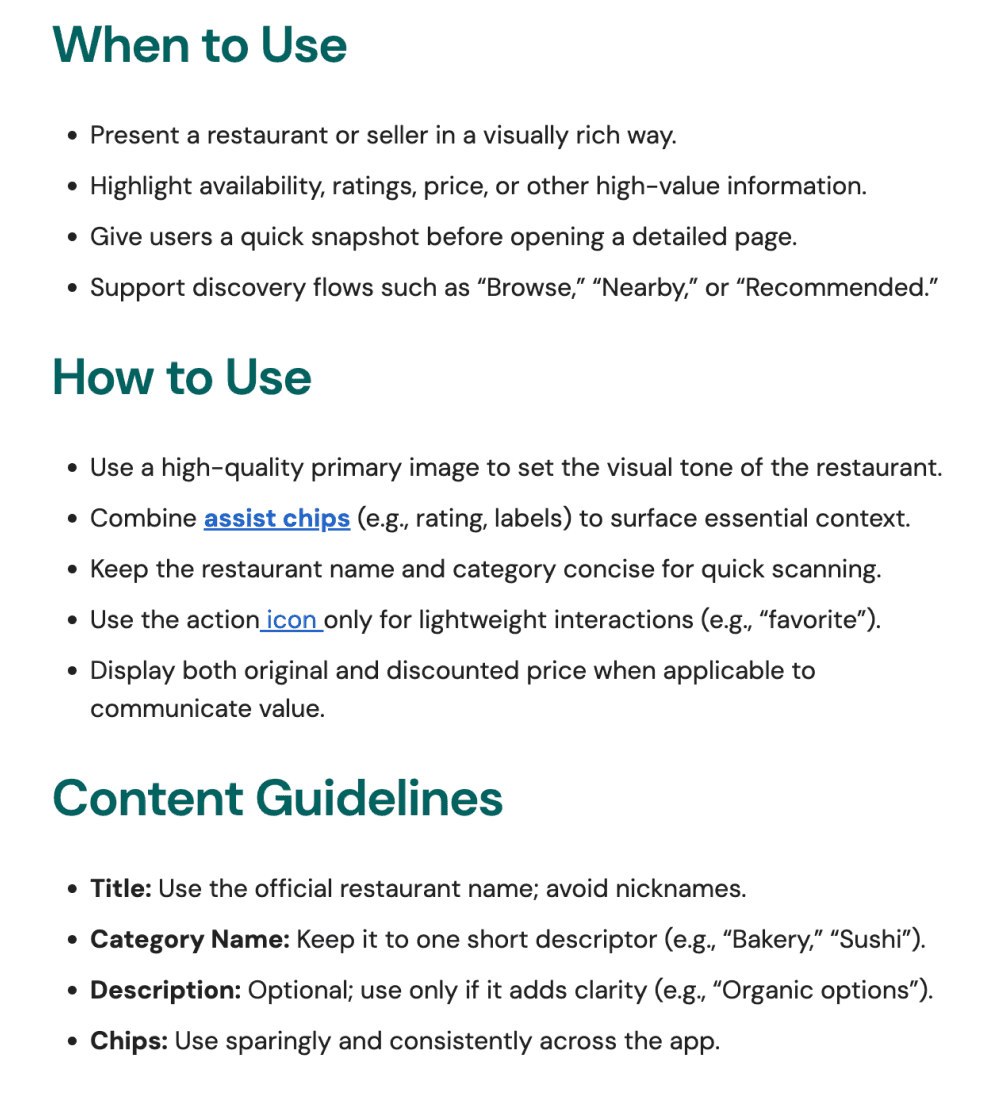
To make the system usable beyond our team, we documented the Bagel Design System in Zeroheight. The content was structured to be readable, scannable, and practical, helping designers quickly understand how to use each component. We also added setup instructions for typography, icons, and libraries to reduce friction and ensure a smoother onboarding experience for future users.


Clear Rules for Every Component
For every component, we defined anatomy, usage, best practice, and accessibility guidelines to ensure flexibility without sacrificing consistency. This structure helps components adapt across different contexts while still following clear, shared rules.
Reflection: Good documentation turns design decisions into shared knowledge, not personal preference. Through this step, I learned how to use a common design language to explain components clearly and consistently. I focused on articulating how and why components should be used, making the system easier for others to understand, adopt, and apply with confidence.
Bagel UI Kit’s Highlights
Flexible by Design
Accessibility, Built In
Ready-to-Use Patterns
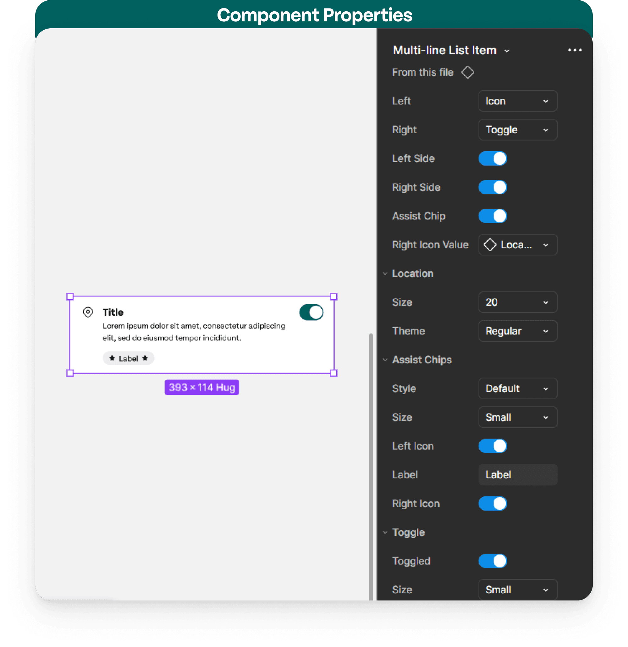
Adjust components to fit your specific context using built-in properties such as boolean controls and dropdowns. Each component is designed with multiple variants, allowing you to quickly adapt layouts, states, and behaviors without rebuilding from scratch.
Every component is designed to meet WCAG accessibility standards, with contrast, spacing, and interaction states considered upfront. This allows designers to focus on crafting experiences while trusting that inclusivity is already accounted for.
Our pre-built patterns combine components into tested, reusable structures. Instead of starting from scratch, teams can quickly assemble interfaces using patterns that are consistent, scalable, and production-ready.
Just drag and move.


Bringing Bagel to the Table (Pitch Deck Time)
We created a pitch deck to clearly communicate the purpose, structure, and value of the Bagel Design System to others. Presenting the system to others allowed us to step outside the design process and evaluate our work from a more critical perspective.


The Imapct of Bagel

Your Time Matters
Save time on rebuilding similar components for every project.

Effortless Consistency
Make your designs look cohesive with half the efforts!

Accessibility That Just Works
Save time on rebuilding similar components for every project.

Be Flexible, Not Fragile
Our highly customizable system can withstand the test of regular updates.
Bagel’s Next Step
We would introduce the Bagel Design System through internal dogfooding, allowing designers and developers to actively use the system in real workflows.

Keep ongoing updates, governance, and iteration to help the system stay relevant as new features, platforms, and constraints emerge.

Based on feedback and real usage, we would refine component flexibility, expand patterns, and improve accessibility and customization options.

Soft Launch and Dogfooding
Refine and Optimize the System
Evolve Continuously Over Time
Special thanks to our team.
Team Members (left to right): Carol, Wendy, Shreya and Rohini
Key Takeaway
This project shifted my perspective from designing screens to designing systems.
🥯 Design System Thinking: A design system is less about UI and more about creating shared decision-making rules that scale.
🥯 Team Collaboration: Consistency comes from collaboration and alignment, not from individual design preferences.
🥯 Product & UX Perspective: Designing components means anticipating future use cases, not just solving the current screen.
