
Project Info
Type
Usability Testing
Client
Role
UX Designer, UX Researcher
Time
March 2025-May 2025
Tools
Figma
Team
Carol B, Emily Y, Gloria Y, Rex F
Improving Content Discovery on Medscape Decision Point Platform
Project Overview
Medscape partnered with our team to evaluate the usability of its Decision Point platform—a video-based educational tool designed to help healthcare professionals access expert perspectives on clinical guidelines.
Through remote, moderated usability testing with 9 healthcare professionals, we examined real-world clinician interaction with Decision Point’s video library and decision-tree filtering system, generating data-driven insights to inform platform improvements.


My Role and Design Timeline
I worked as one of four UX designers on this project, alongside Gloria, Emily, and Rex. We shared responsibilities equally across all stages—from planning and testing to analysis and presentation.
I moderated 2 usability sessions, took notes for two others, and contributed to both the final report and the client presentation. I also led the recommendation for redesigning the filter panel based on patterns I observed during testing.

Screenshot of usability testing Zoom session

Design Process
Stage 1-Aligning with the Client (2 Weeks)
Starting with a Kick-off Meeting
Our process began with a kick-off meeting with the Medscape team, where we sought to understand not just the platform, but the business context behind it.
The client explained that Decision Point is a video-based clinical decision-support tool designed for working healthcare professionals. While the content itself was high quality and medically reviewed, user behavior revealed a pattern: most clinicians were accessing videos through direct email links rather than browsing the platform independently.

Kick-off meeting with Medscape client
Reframing Our Research Focus
At first glance, this appeared to be a general engagement issue. However, through discussion, we realized the client was less concerned about overall traffic and more interested in understanding why clinicians were not organically exploring the platform.
In other words, the key question shifted from:
How do we increase engagement? >>>>>>>>>> Why aren’t users navigating and discovering content on their own?
This reframing clarified our research direction. We identified critical touchpoints where breakdowns might occur, particularly the homepage, category pages, decision tree (filter panel), and video landing pages. These were moments where users either continued exploring or dropped off.
Designing Tasks and Scenarios
With a clearer focus, we designed structured usability tasks that simulated realistic browsing behaviors. Rather than testing isolated features, we created scenarios that required participants to:
Explore videos by specialty
Use the Decision Tree filtering system
Navigate between content and refine results
Reflect on their overall experience

Specific Tasks
Design Process
Stage 2-Testing in the Real World (3 Weeks)
For Usability Testing
Moderated Remote Usability Testing
(Zoom)
For Analysing Results
System Usability Scale (SUS)
Recruitment
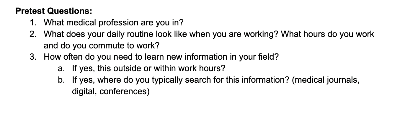
To align with Medscape’s target users, we set criteria helped ensure the feedback we collected would be relevant to real-world usage of the Decision Point platform.
For this study, 9 participants were recruited, including 4 physicians, 2 nurses, 2 dentists and 1 pharmacist.
Criteria
Working HCPs
Spends free time learning about new medical discoveries/research
Primarily uses desktop interface for research

Moderated Usability Testing
Structure
To evaluate how clinicians interact with Decision Point in realistic scenarios, we conducted a series of moderated remote usability testing sessions over Zoom with nine healthcare professionals across specialties. Each session was led by one moderator and one note-taker, allowing us to observe both task performance and behavioral patterns in depth.



System Usability Scale (SUS)
The System Usability Scale (SUS) is a standardized measure of usability scored from 0–100.
Medscape Decision Point received:
• Overall SUS score: 74.2 (above industry benchmark of 68)
• Learnability score: 87.5 (strong ease of learning)
• Usability score: 70.8 (indicating room for improvement in efficiency)
These results suggested that while Decision Point is approachable, friction still exists in navigation and content discovery.


Score Calculation
Design Solution
Stage 3-Turning Findings into Action (2 Weeks)
Identifying top 4 issues
After completing testing, we synthesized our findings through collaborative review sessions, combining observation notes, transcripts, task performance outcomes, and SUS results. Rather than listing every usability problem observed, we prioritized issues based on frequency, severity, and impact on core tasks such as navigation and content discovery.

Issue 1:Unclear Path Back to the Homepage
33% of participants struggled to return to the Decision Point homepage and often relied on breadcrumbs or the browser back button, indicating unclear navigation expectations.
The current header structure has the category
name in the middle of the Medscape logo and the Decision Point logo. A few participants
clicked on the Decision Point logo expecting to return to the homepage, but were instead
taken to the category page.

Recommendation 1: Simplify Header Navigation
Update the header so the Decision Point logo links directly to the homepage, providing a clear and intuitive return path. Move the category label to the center of the Decision Tree page to maintain context while reducing navigation confusion.

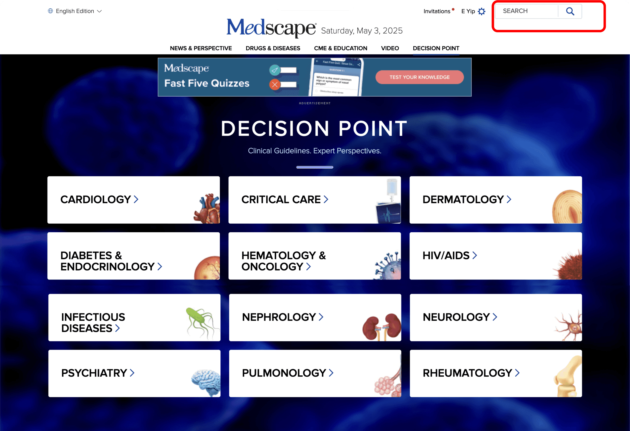
Issue 2: Preference for Search Engine Over Filters/Categories
56% of participants expressed more preference for a search-driven experience, mentioning that the categories and filters were too rigid and clicking through them was too time consuming.

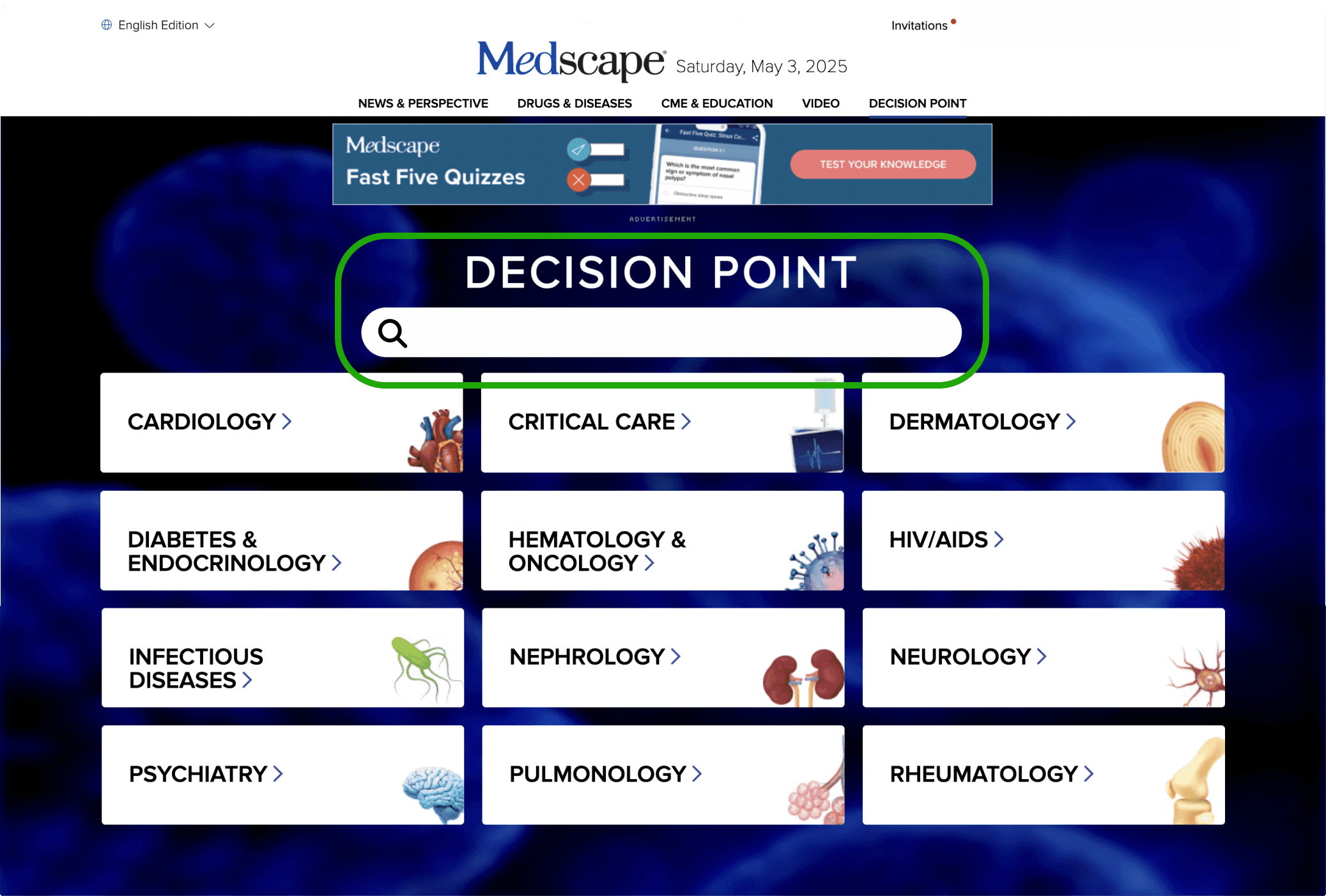
Recommendation 2: Add a clear, visible search bar on the Decision Point Homepage
In order to accommodate users who prefer a search-driven experience, we recommend
adding a clear, visible search bar on the Decision Point Homepage. Additionally, we
recommend removing the Medscape search bar on the top right of the homepage to
avoid the confusion of having two search bars on one page.

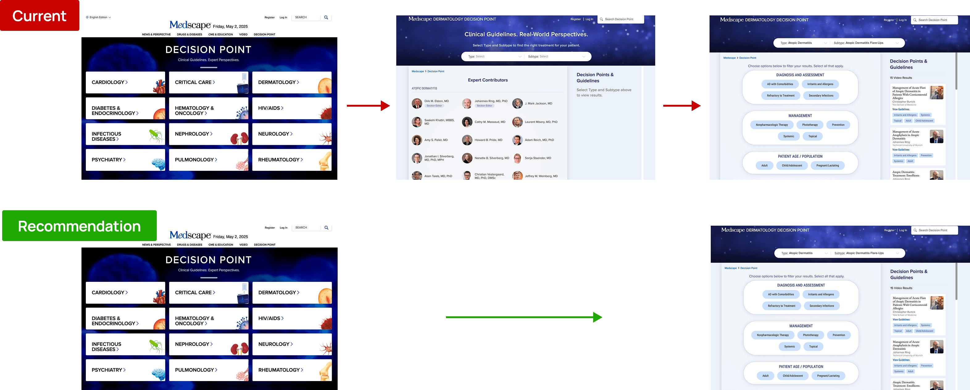
Issue 3: The Category Page Interrupts the Browsing Flow
33% of participants hesitated on the Category page, scrolling through the page before returning to the top because they were unsure how to proceed. The coexistence of multiple entry paths—“Start,” and dropdown filters—without clear visual hierarchy created uncertainty about the intended next step. Instead of guiding users forward, the Category page often slowed or interrupted the browsing flow.
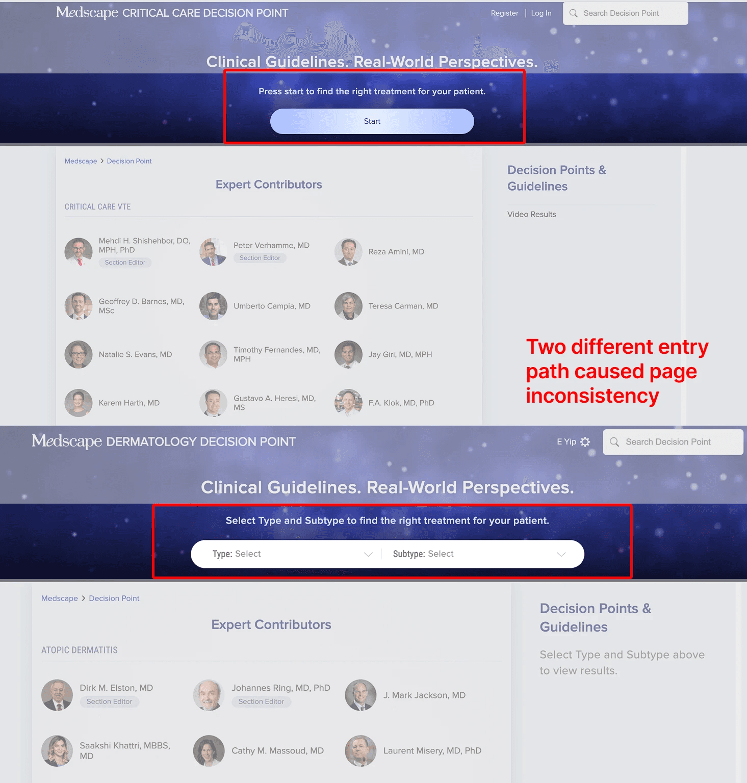
Recommendation 3: Streamline the Category Page Flow
In order to better streamline the experience of users browsing for video content, we
recommend removing the Category page entirely from the user flow. This change
lessens the amount of clicks the user needs to get to their goal: filtering and seeing the
video content that is available in Decision Point.
Issue 4: Filters Overshadow Video Content
22% of participants found the decision tree layout visually confusing, noting that the large filter panel overshadowed video results and made it harder to focus on content.

Recommendation 4: Rebalance Layout to Prioritize Content
Reduce the size of the filter panel and expand the video section to better prioritize content. Redesign the filters as a left-aligned vertical list to improve clarity and make options easier to browse.

Deliver the Work
Client Feedback
We presented our final findings and recommendations to the Medscape team via Zoom, followed by a detailed written report. The client responded positively, highlighting the depth of our research and the clarity of our insights. They noted that several findings aligned with internal hypotheses and appreciated how our testing validated these assumptions with real user data. The team plans to continue reviewing our report and use our recommendations to inform future iterations of the Decision Point platform.

Conclusion
Key Takeway
Looking back, one of the biggest takeaways from this project was seeing how even small design decisions, such as layout and content hierarchy, can significantly influence user behavior. This project not only strengthened my skills in usability testing and collaborative research, but also deepened my understanding of how meaningful design decisions become when they are grounded in real user feedback. It was incredibly rewarding to know that our work made an impact, and even more motivating to see how user research can directly shape product direction.